Toggling Between Solid and Void
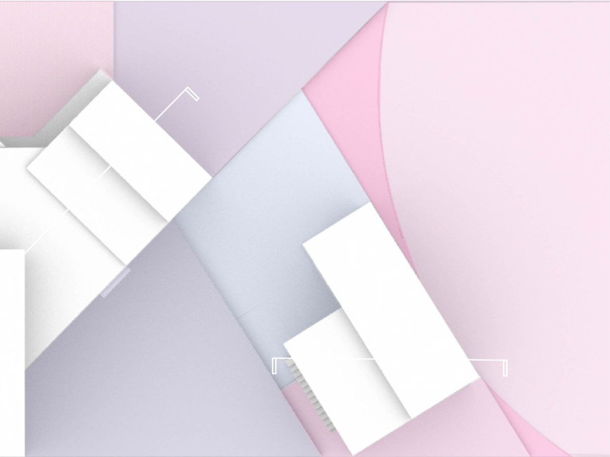
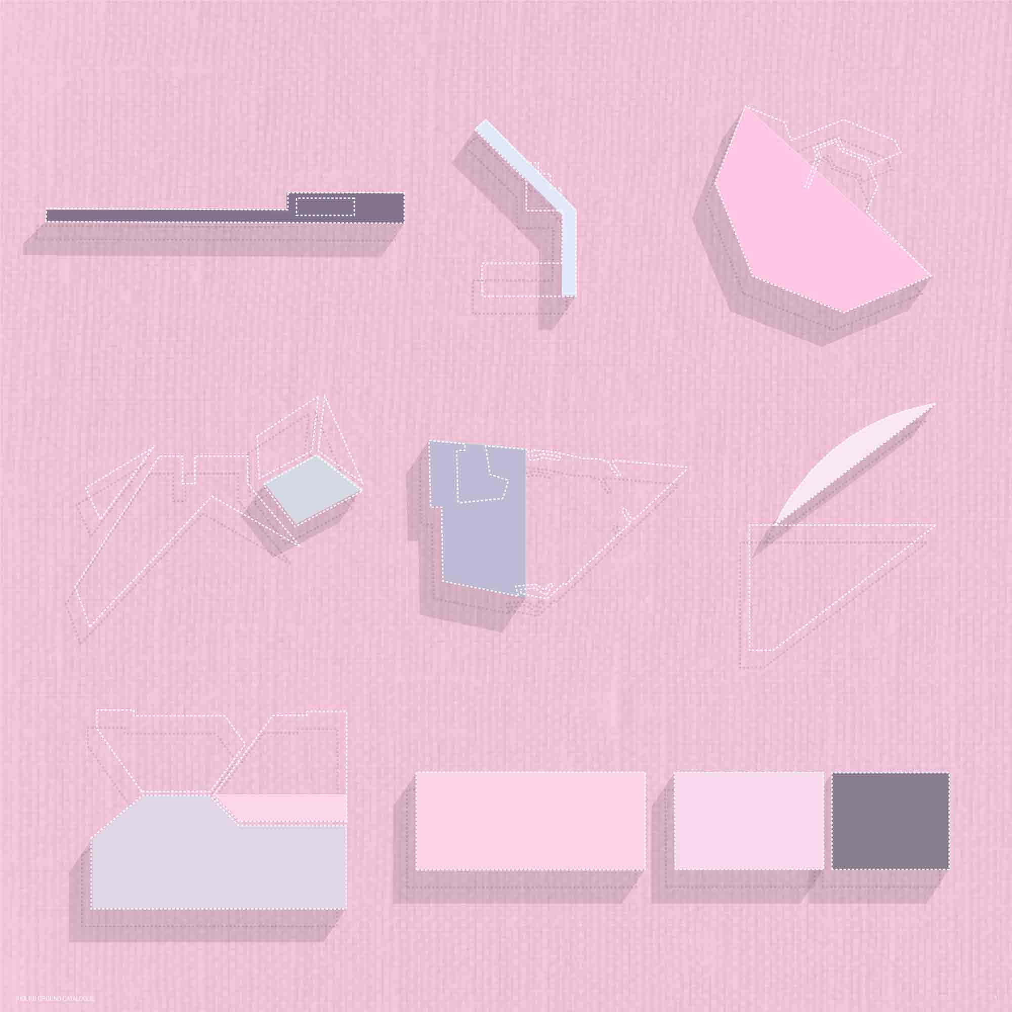
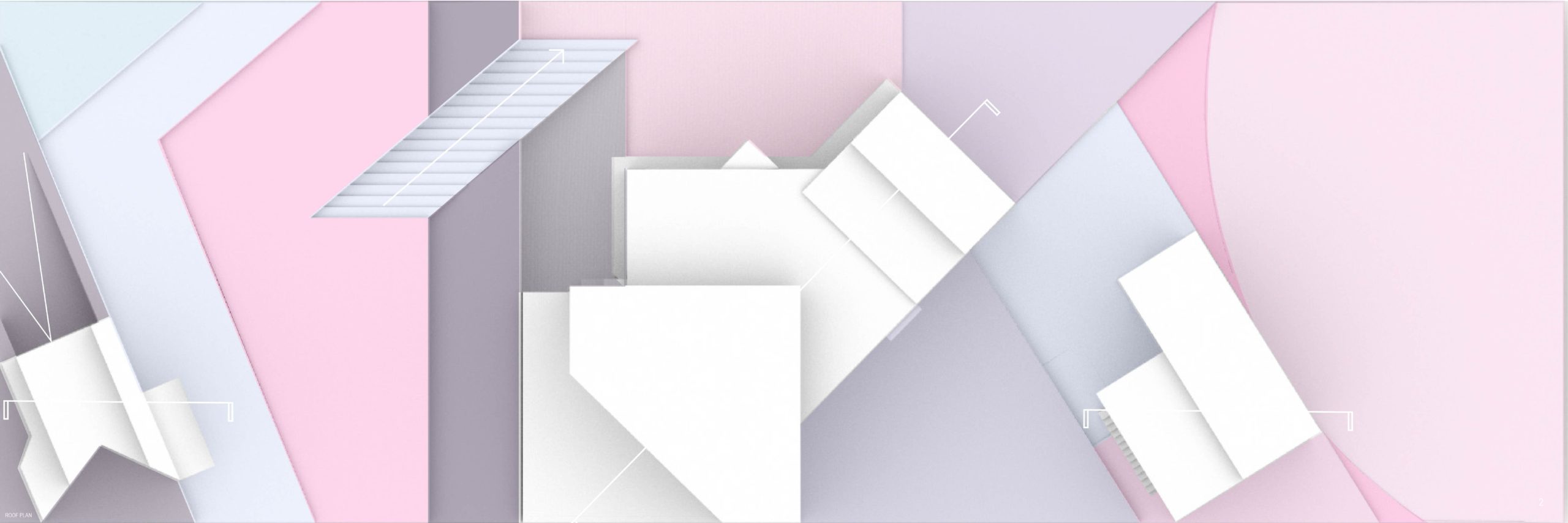
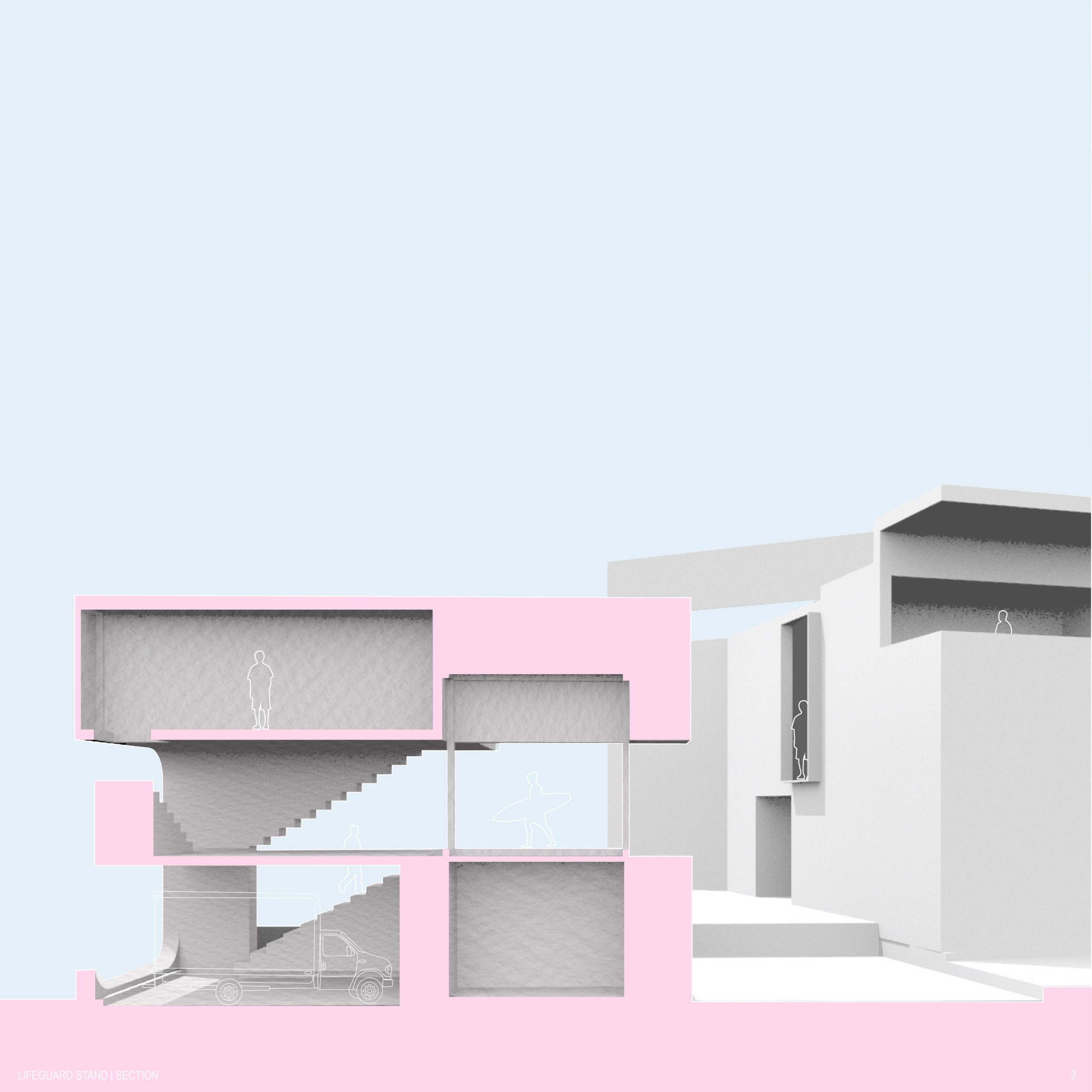
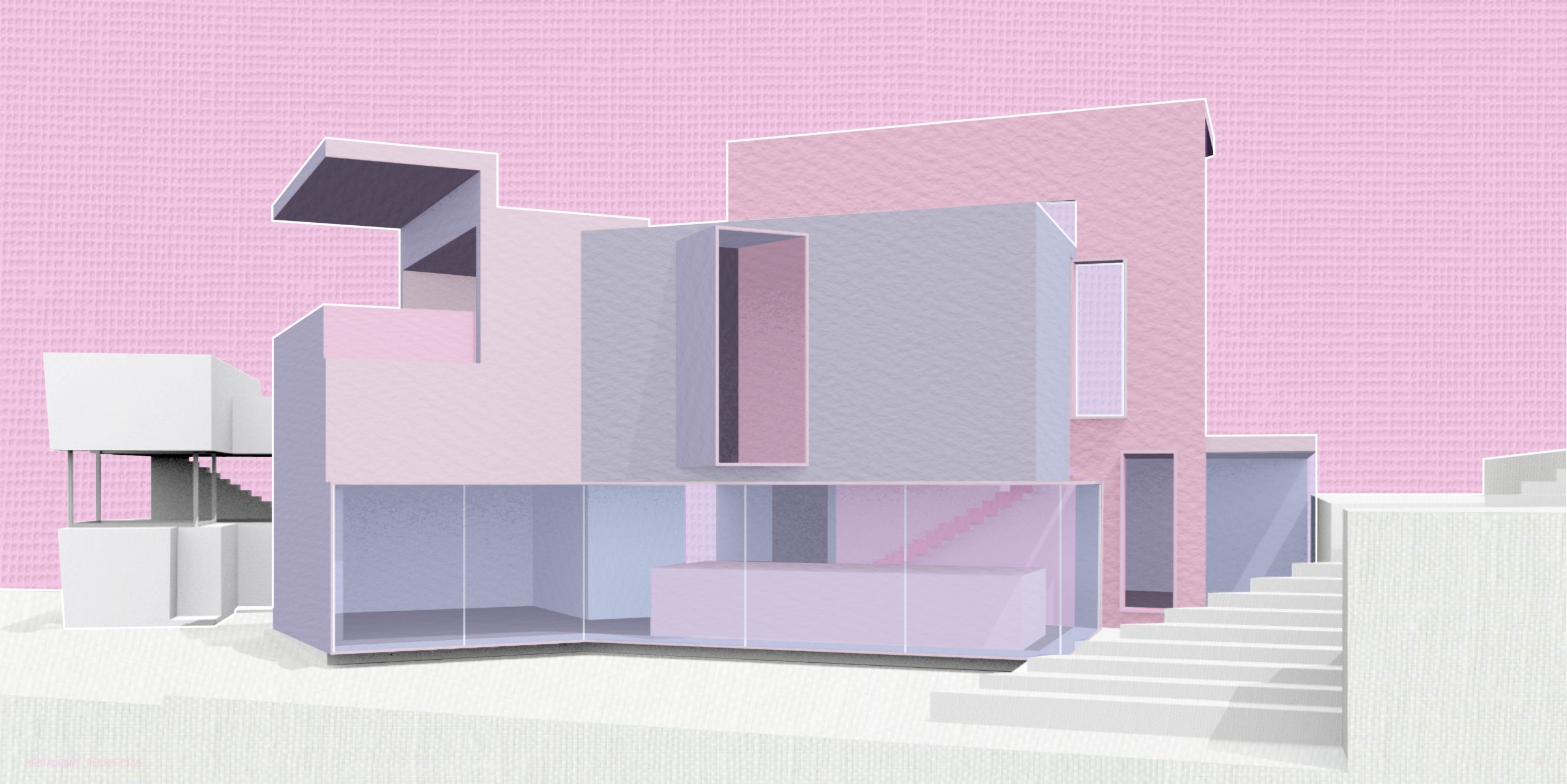
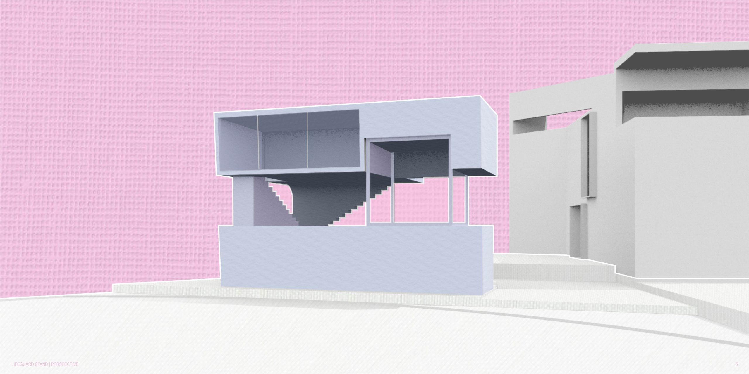
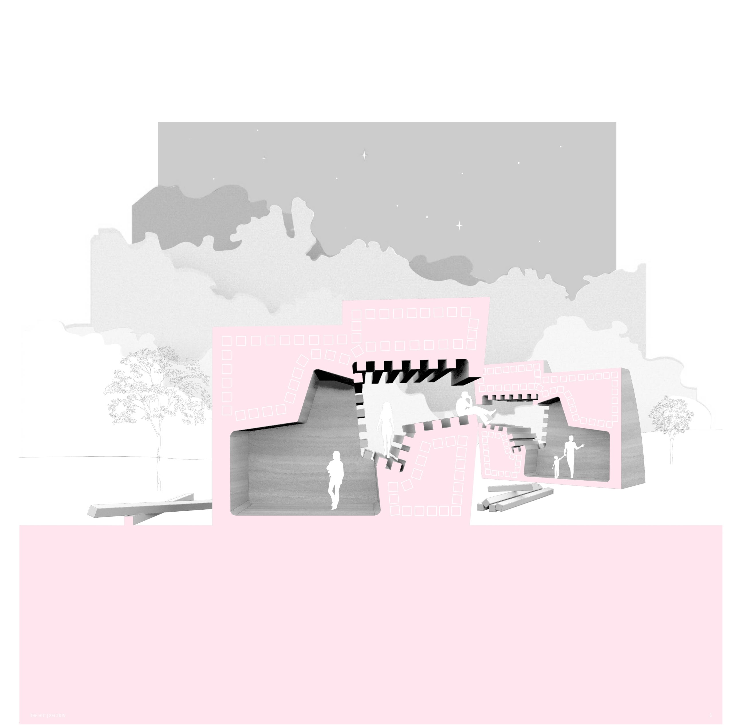
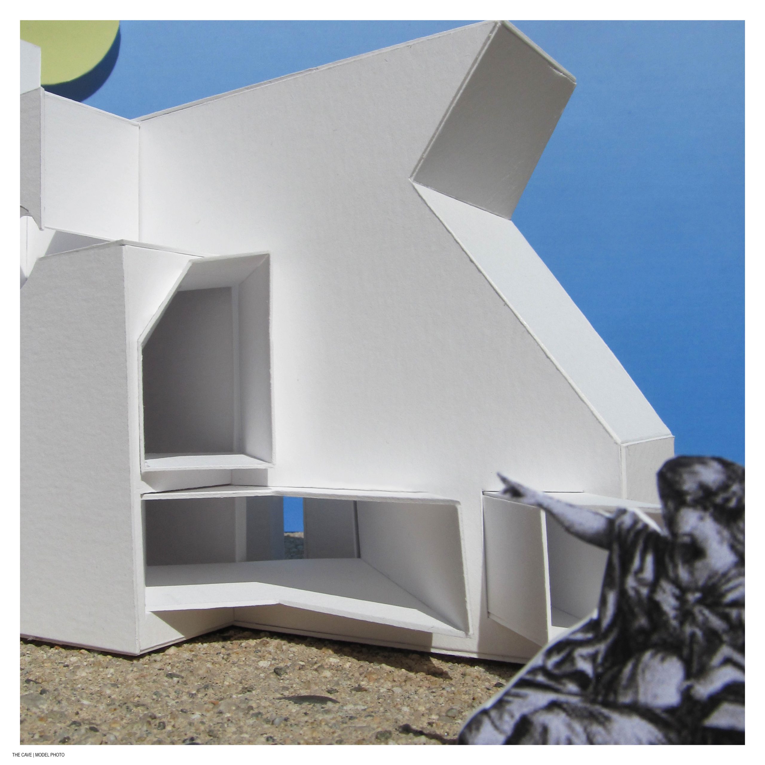
My project is shaped by an exploration of flatness and depth, guided by the idea of toggling between the solid and void, a concept which I have carried with me since the Cave, Hut, and Tent project earlier in the semester. My designs for a lifeguard stand, restaurant, and parking kiosk use the solid as a means of shaping their exterior forms and carving out interior spaces where extrusions are pushed into the solid primitive. This is exemplified in the restaurant by maintaining the hood of each extrusion whose intersection became a void. The site plan addresses the slope of the topography through manipulating the heights of figure ground primitives to create a stepped landscape. My project’s graphic language plays with the dichotomy of flatness and depth through a combination of flattening textures and rendering overlays to incorporate shadow.
