The Upside Down
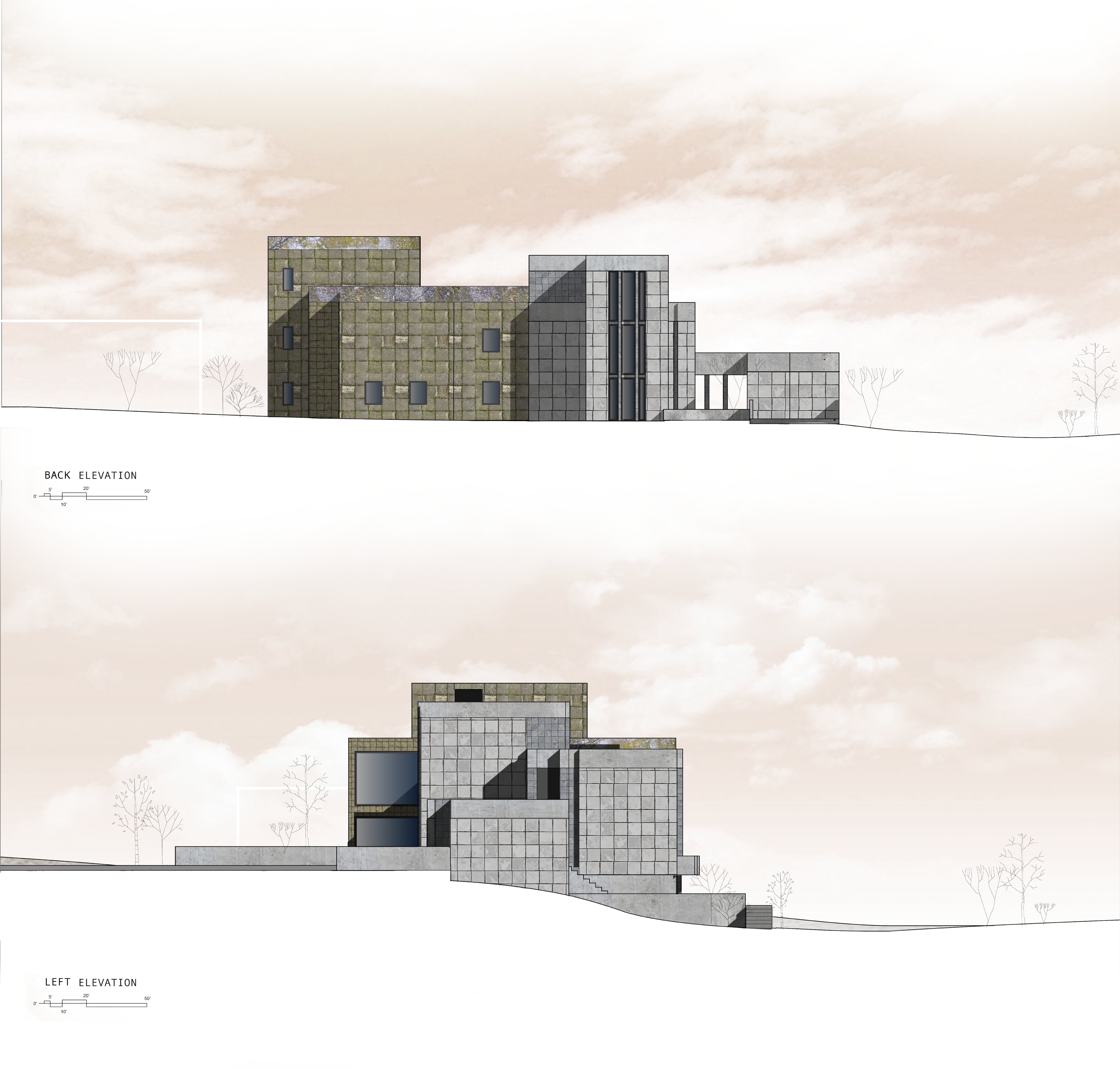
In order to create a “diptych” copy of Frank Lloyd Wright’s Millard House, I used a projection method of the original house to produce a similar form with subtle, yet significant differences.
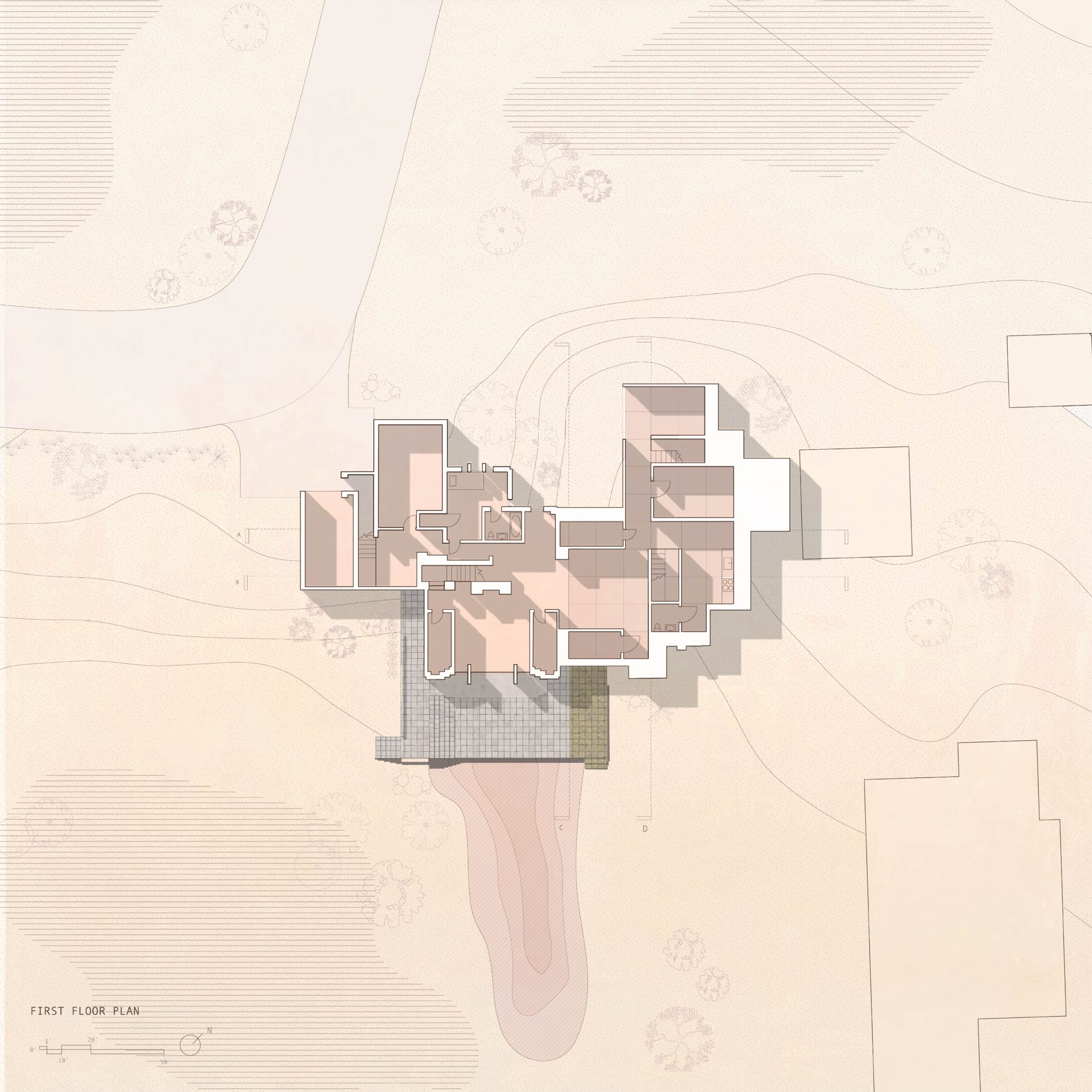
I rotated my addition 90 degrees and intersected the two forms together, but due to the L shaped footprint of the house, it gives a mirrored illusion of one cohesive and seemingly symmetrical building.
But since the interior program of the addition is also shifted, the spaces flow together as a single home with one main entrance and a large, double height living space which connects the two structures.
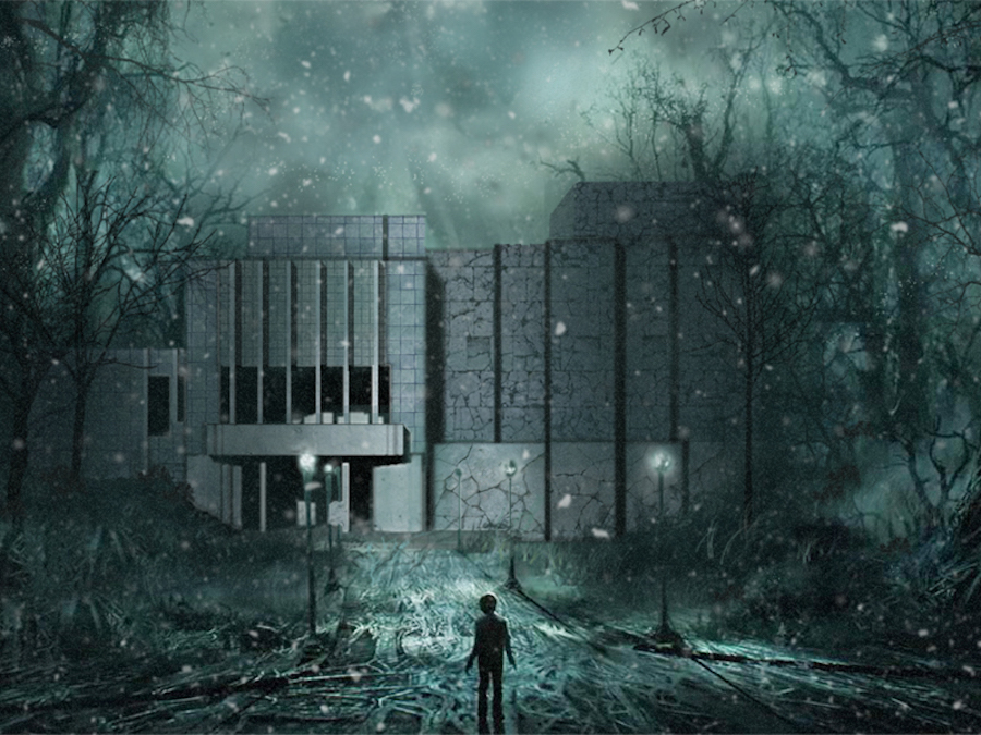
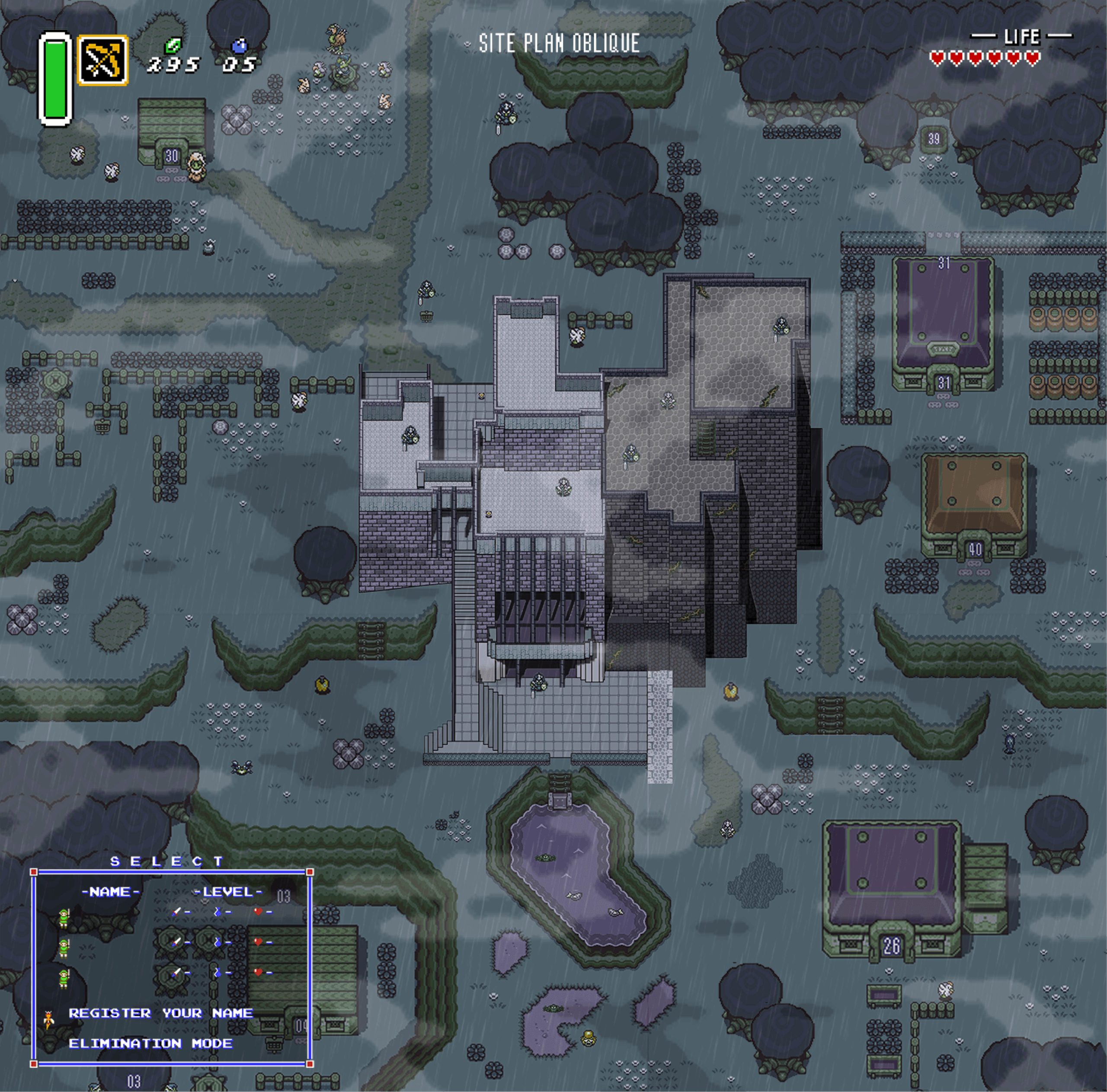
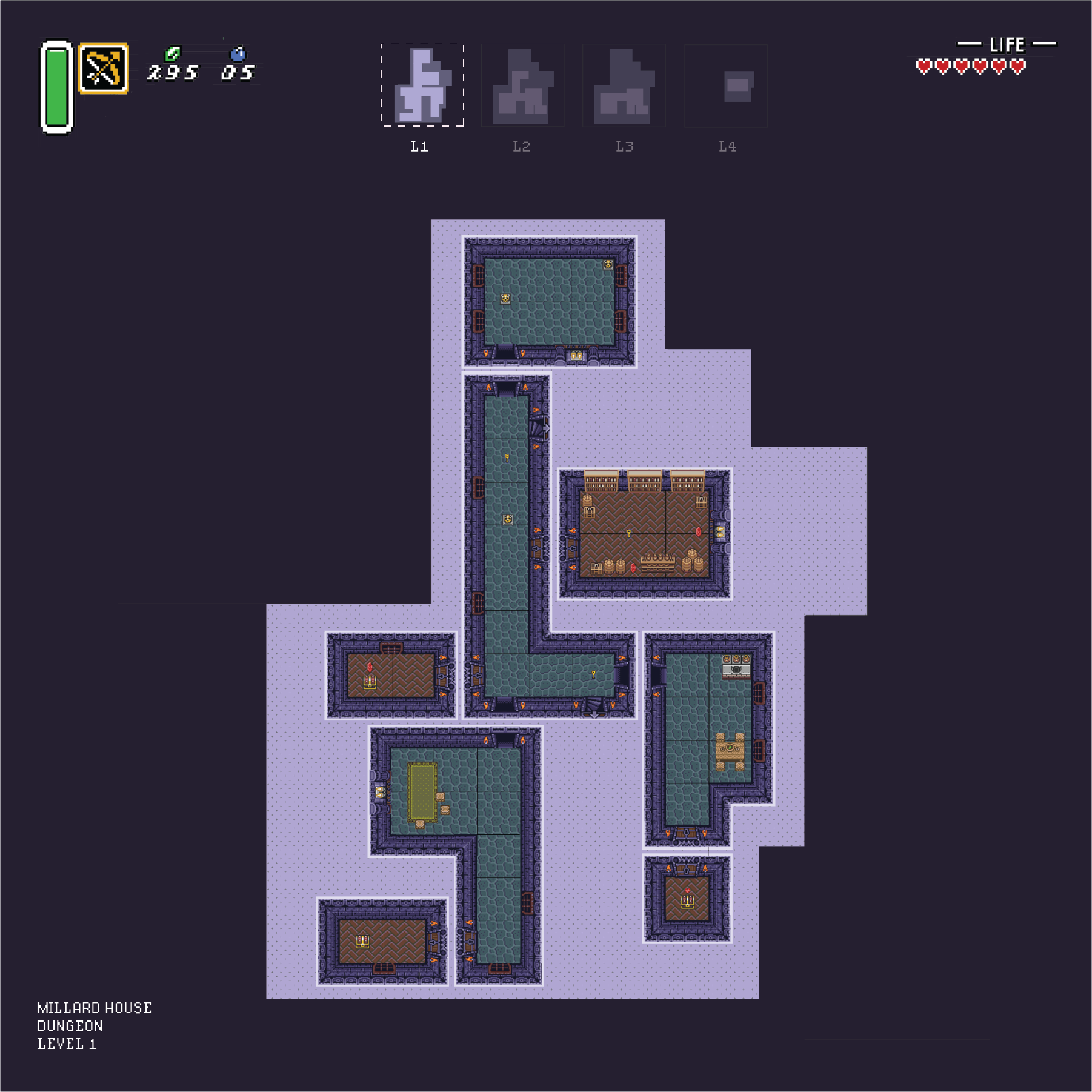
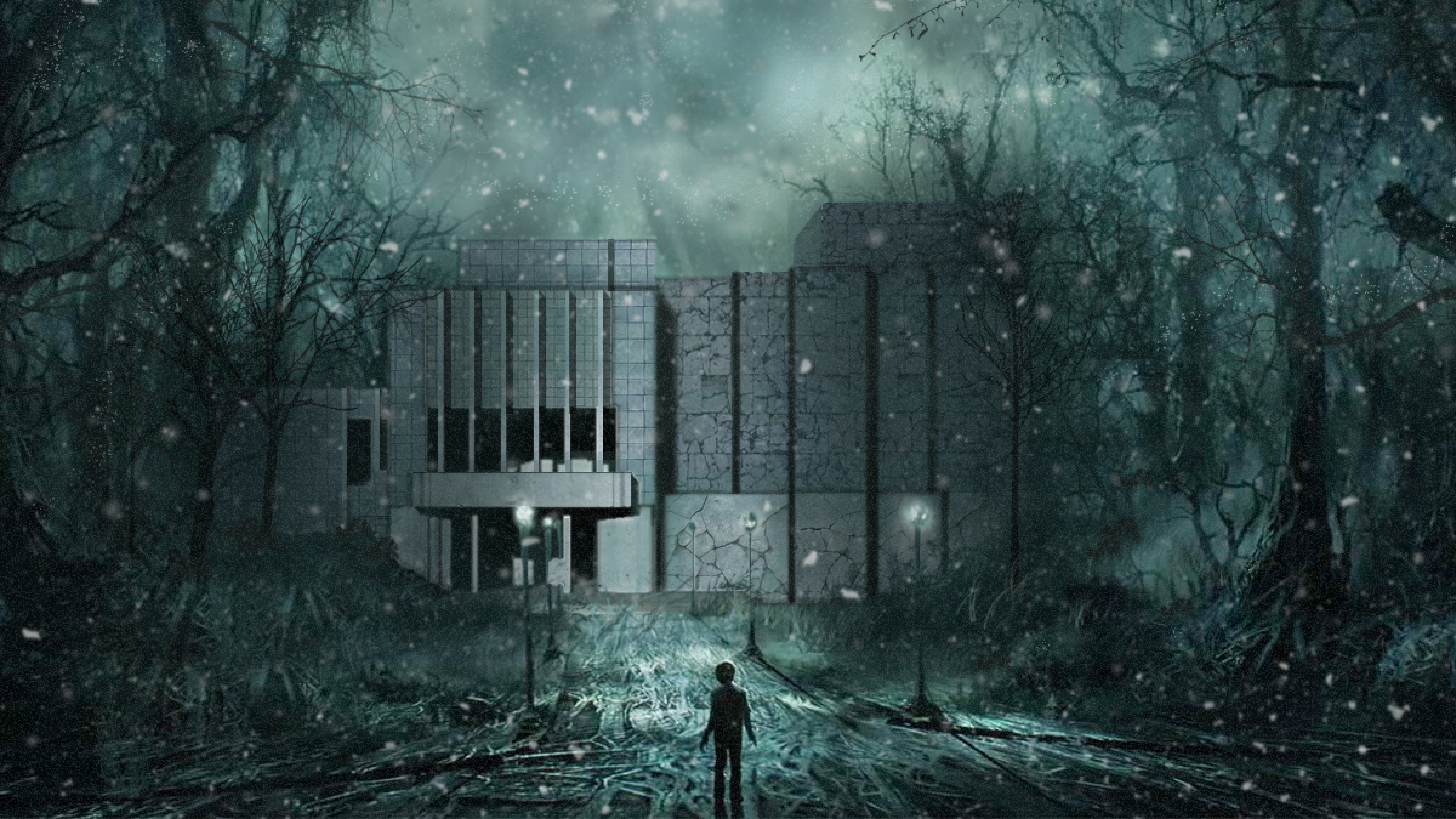
Because of this perceived symmetry, I wanted to clearly distinguish the borders of the diptych through materiality, both exteriorly and interiorly. The addition was designed to feel like a more dark and decrepit version of the original- similar to the Upside Down in Stranger Things. I wanted to emphasize this with a more gloomy and ominous style of drawings shown in the perspective, dungeon plans, and site oblique.
